Hitting the Ground Running: Indoor Tee Brand Launches with Momentum
The Challenge: Golf… Without a Clubhouse?
Indoor Tee is a golf simulator that uses Trackman iO technology—the same setup pro golfers use to train. But unlike traditional simulators found at driving ranges or country clubs, Indoor Tee operates 24/7. Members gain access to the facility using an app, so they can book a bay whenever they want, whether it’s 11 AM or 11 PM. With no staff, the website had to do the heavy lifting. IndoorTee.com explains the concept clearly, sparks excitement, and drives people to sign up.
Our Approach: Make the Website Feel Like the First Tee
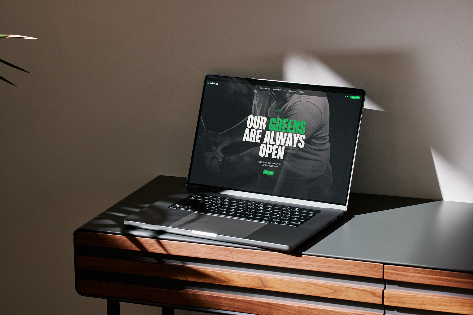
Indoor Tee’s brand and website are as sharp and modern as the simulator itself. The website keeps it simple, but exciting. It gives people just enough to understand what Indoor Tee is—and why they should try it. The self-contained, flagstick-inspired mark gives an immediate sense of digital interactivity. It’s tech-forward, yet minimalistic—and it’s inviting you to come play. Here’s how we did it:
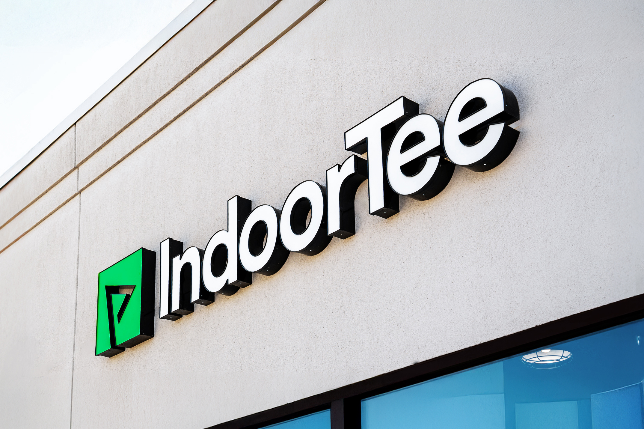
- Brand with purpose We designed a clean, flexible logo system hinting at a golf flag while also working as a digital “play” icon. Simple, clever, and perfect for a screen-based experience. This logo is typically paired with the Indoor Tee wordmark featuring circular letter forms that allude to the golf ball itself.
- Sleek, interactive website The site had to look and feel like the tech it represented. With bold visuals, smooth scrolling, and just the right amount of motion, we gave visitors a feel for the energy of the simulator before they ever stepped inside.
- A membership page that works like a sales pitch Since there’s no one on-site to walk you through pricing, the membership page had to do that job. We laid it out more like a software pricing page than a traditional golf site, making it easy to compare options and lean toward the annual plan.
- Real tech, real images The space wasn’t finished yet, so we worked directly with Trackman to find high-quality images that showed the experience in action. Even without photos of the Lincoln location, visitors could picture themselves swinging in the bay.
- Smart, straightforward copy Our writing style was all about clarity and momentum. We avoided golf clichés and focused on what made Indoor Tee different, better, and worth a shot—even if you’d never used a golf simulator before.
What Happened: Real People, Real Interest, Real Results
The site strategically launched in December 2024—just in time for winter, when golf in Nebraska usually shuts down. And people noticed.
Here’s what happened in the first month:
- 3,700 new users A strong start for a brand-new business.
- 19,000 site events People were clicking, scrolling, and digging in.
- 1,200+ booking clicks Over a thousand people were interested enough to check out tee time availability or buy a membership.
And the best part? Sign-ups started coming in before the place even opened.
What You Can Learn from Indoor Tee
If you’re launching something new—or explaining something people haven’t seen before—here are a few things that worked for us:
- Say just enough People don’t need every detail upfront. Give them the basics, make it look good, and let curiosity do the rest.
- Think like your audience If you were visiting your own site for the first time, would it make sense? Would you know what to do next?
- Look and feel matter Great design builds trust. A sharp-looking site makes people think, “This place knows what it’s doing.”