What the Font?
Why Typography Deserves Way More Credit
When most people think about branding, their minds go straight to color palettes, logos, maybe even voice if they’re a little more dialed in. And yes—those things matter. A lot.
But have you ever stopped and really thought about the font?
Not just a quick “serif or sans serif” decision, but a genuine pause to ask what your typography is actually communicating?
Maybe you should, and here’s why.
Typography is one of the first impressions your brand makes, and it happens before anyone reads a single word. The way something looks immediately shapes how it feels. Clean, structured type can signal clarity and professionalism. Something more expressive might feel playful, creative, or even a little rebellious. The exact same sentence can come across completely differently depending on the font it’s set in.
That’s not decoration. That’s communication.
Here’s where it gets tricky: there are a lot of fonts. Not just “a lot” in the casual sense, but an overwhelming number—each with its own personality, history, and nuance. Some feel timeless, others distinctly modern. Some are built for readability, others for impact. Choosing one, or more realistically, a combination, isn’t just a quick design decision. It’s about aligning visual tone with brand identity.
Which is why typography, when it’s done well, starts to feel less like a task and more like a system.
The interesting part is that great typography often goes unnoticed. You’re not supposed to stop and think, “Wow, what a great font choice.” Instead, you feel it. You trust the brand more. You read longer. You move through it without friction. It works quietly in the background, shaping perception in ways that are hard to pinpoint but impossible to ignore.
But that sense of ease doesn’t happen by accident.
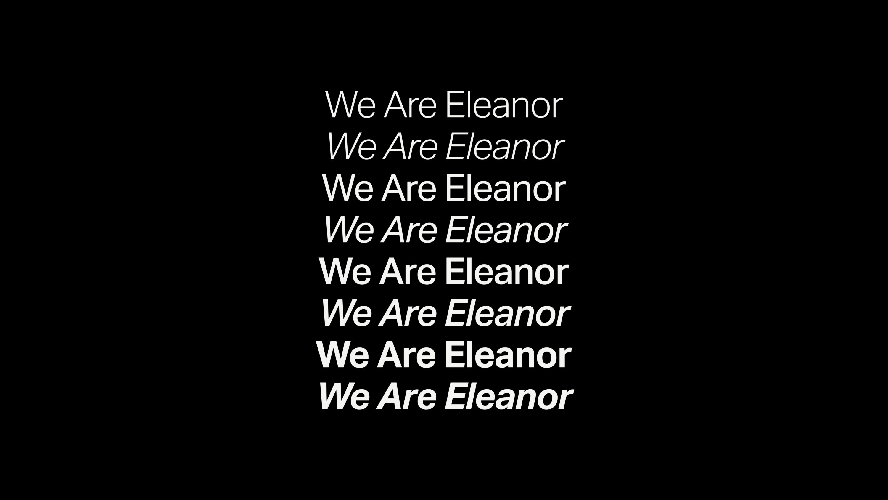
Strong typography isn’t about picking a single font and calling it a day. It’s about building structure: a headline typeface that sets the tone, a body font that supports readability, and sometimes an accent that adds personality without disrupting everything else. Then comes hierarchy, spacing, scale, contrast—all working together to create something cohesive and natural.
When it’s off, you notice it immediately, even if you can’t explain why.
When it’s right, it does something more powerful than aesthetics alone: it creates recognition. Consistent typography becomes part of your brand’s visual language. Over time, people don’t just recognize what you say—they recognize how it looks when you say it. That’s why chasing trendy fonts rarely holds up. What feels current today can feel dated tomorrow. The goal isn’t just to look good in the moment; it’s to choose typography that feels true to your brand and can evolve with it.
So… what the font should you choose?
The honest answer: it’s not something to figure out in isolation. Because typography isn’t just a styling choice—it’s a system that has to hold up across every touchpoint where your brand shows up. It needs to feel consistent on a website, a social post, a presentation, and everything in between. That level of clarity doesn’t come from picking a “nice font.” It comes from strategy, restraint, and a clear understanding of what your brand is trying to communicate.
That’s where we come in.
At Eleanor, typography is never an afterthought or a design detail to sort out later. It’s one of the foundational decisions we make when building a brand system—alongside voice, visuals, and positioning. We approach typography the same way we approach everything else: intentionally, in context, and with a focus on how it needs to perform in the real world.
Because the goal isn’t to find a font you like, it’s to build a brand that people recognize instantly and trust without needing to think about why.