Fly Fitness Brand
What strengthens, uplifts, and looks incredible? The new Fly Fitness brand. In order to break into a national franchise market and elevate their brand, the Eleanor team brought a whole new type of energy to help Fly Fitness achieve their goal of franchising in 35 states in five years. They hit the ground running with two in the works already since their brand launched.
The Challenge
Fly Fitness is a fitness studio that strengthens as a community, uplifts each other, and creates a space of inclusivity. After several years of successfully running their two Lincoln, Nebraska locations, and launching a third and fourth location in Fargo, North Dakota, the team at Fly felt that in order to move more effectively into a national market, and to combat perception that they only serve women, they’d need to recharge the Fly Fitness brand with a new visual identity, messaging, and energy.
Strategy and Tactics
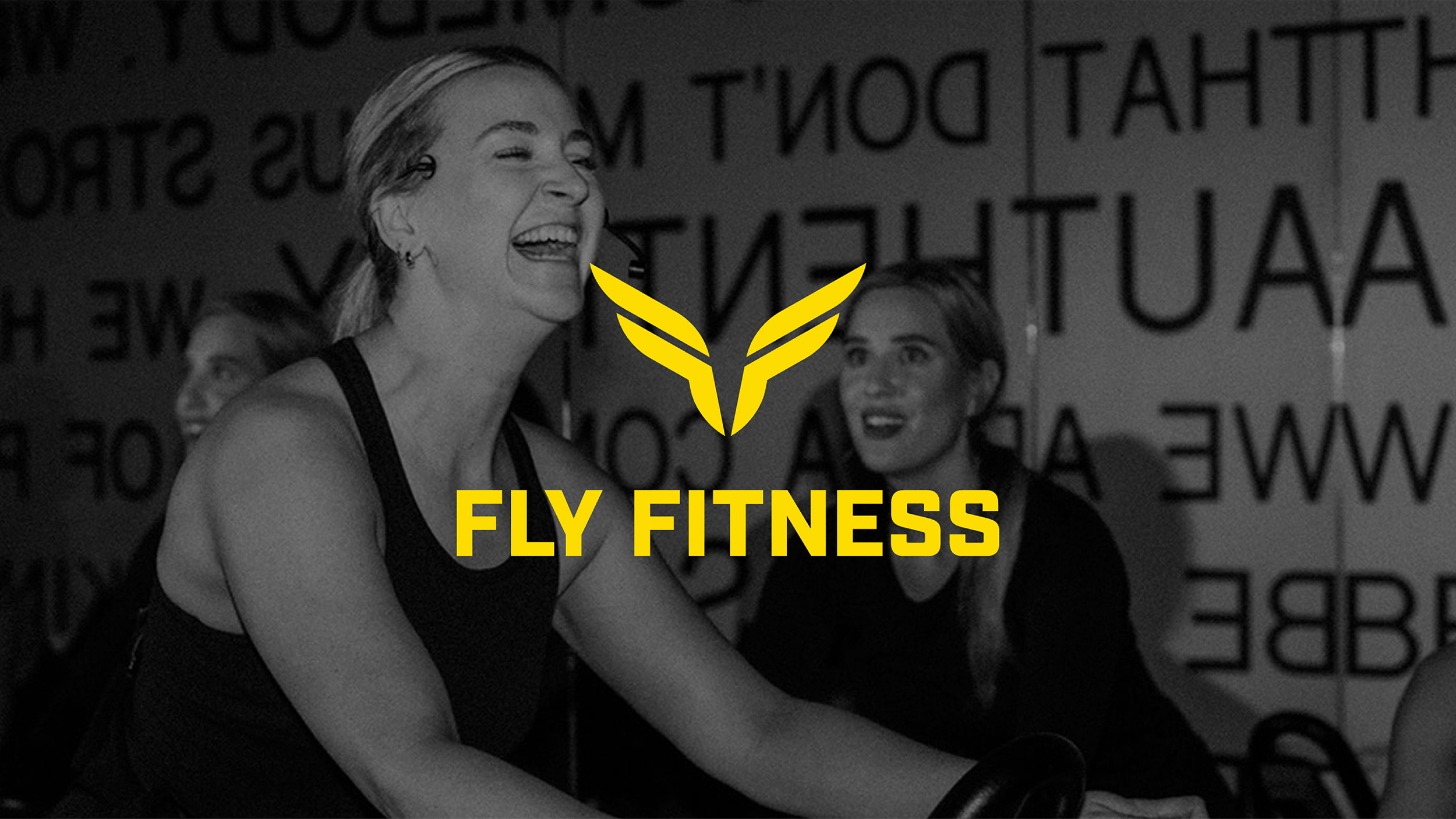
To reposition the Fly brand as an exciting new leader in the national fitness industry, Eleanor Creative streamlined the brand’s complex logo into four powerful and poised shapes, creating a gestural set of wings as well as a subtle nod to the the capital “F” letterforms that serve as the initials for Fly Fitness. Applying this updated brand to on-site signage, an all-new, user-focused website experience, and social media channels, Fly was able to begin franchising, with wings out.
Let Your Wings Fly
As of this moment, Fly Fitness has expanded to two new franchise locations, and shows no signs of stopping.