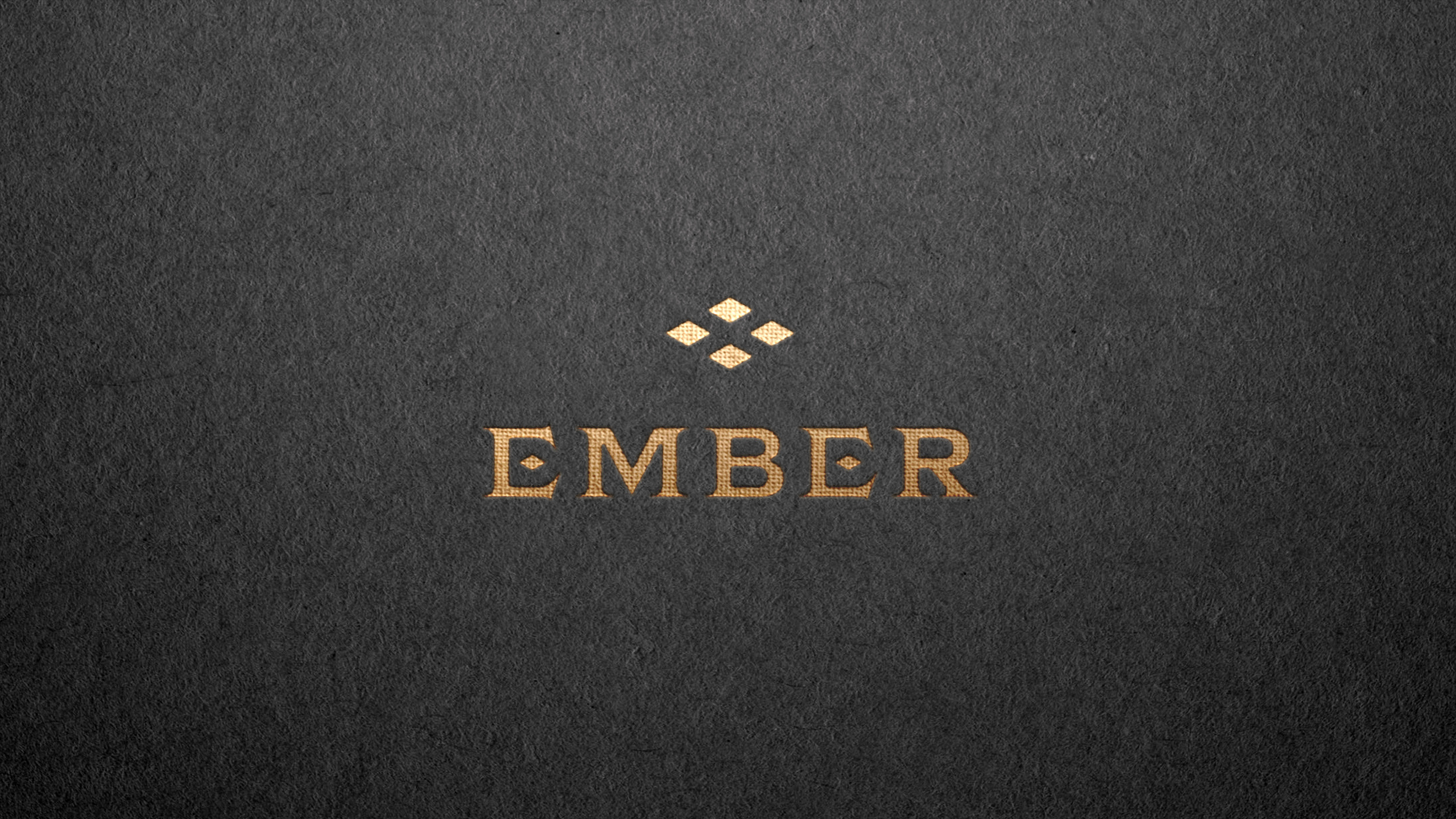
Ember Logo Design
Ember is Lincoln’s newest community for women in business. Formerly Local Girl Gang, they came with years of experience in cultivating sparks of inspiration and support for local entrepreneurs. It was time for their own brand to mature and magnify.
They wanted their members to identify with a brand that emphasized the power of women, and inspired them to nurture the sparks of energy and inspiration within themselves. We crafted a new name — Ember — and recognized that they needed a brand that sizzles with sophistication and enigmatic energy.
With a name like Ember, that has such fiery connotations and sounds soft when spoken, we knew the logo would need to feel iron-cast and also effortlessly elegant. Its deconstructed seriffed font and minimalist mark possess a dynamic sense of tension when set against a classic color palette and implementation. The resulting logo feels dangerous, in all the best ways: it plays with fire, and feminine ferocity — and when those things combine, it’s something magical.
Since implementing their new logo, Ember has only continued to grow — like wildfire. Membership has increased, and the following on social media is involving local women like never before. Not to mention, this brand was named best Logo Design at the American Marketing Association – Lincoln’s Annual Prism Awards Ceremony.