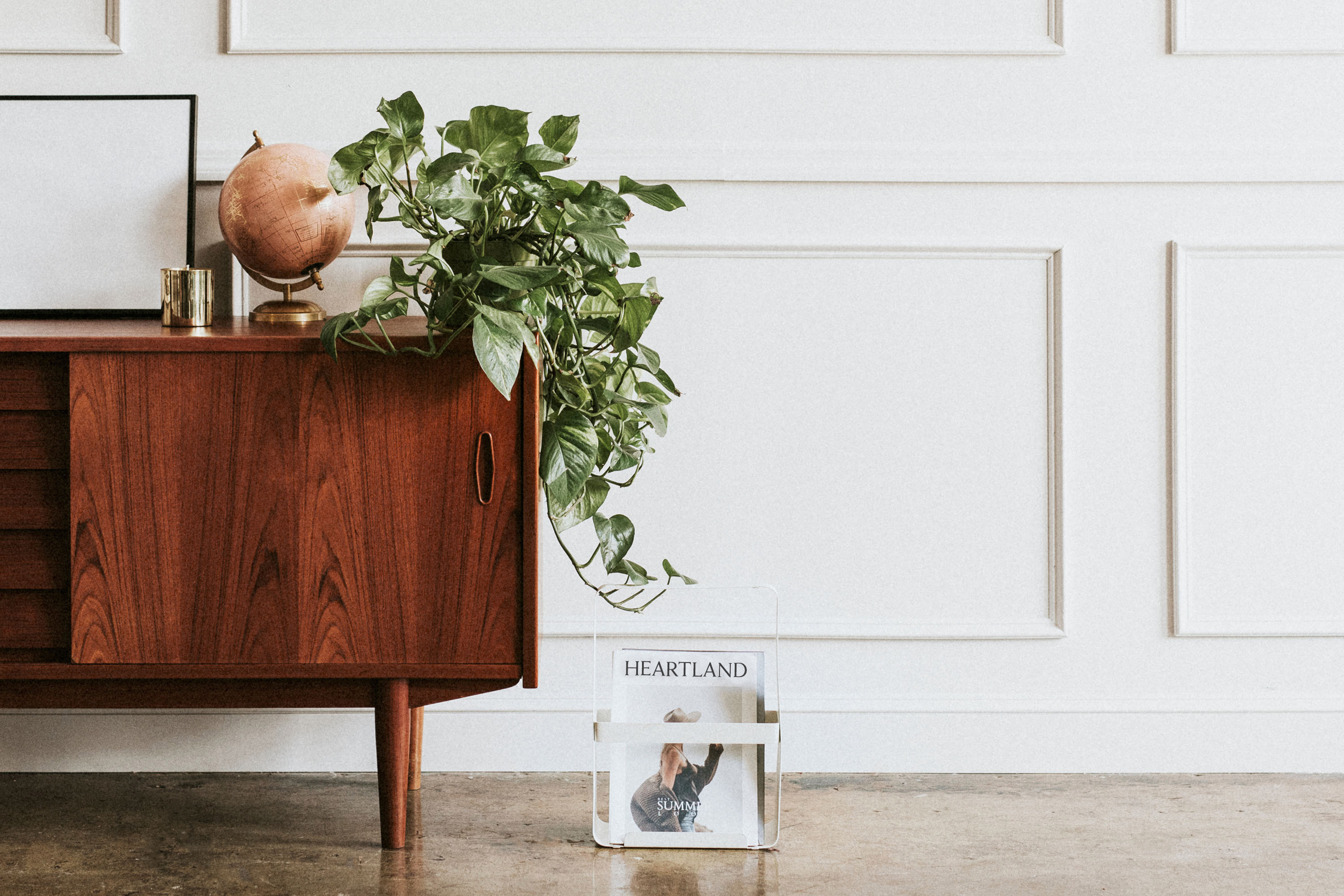
Heartland Flats is a modern brand well suited for the Midwest. It is domestic, clean, stylish, mid-century, and historic. It had to be all these things because the Heartland is a patchwork of manufacturing centers, big farms, large cities and small towns and this brand needs to appeal to them all. The Heartland Flats brand draws from these roots to create a stylish yet grounded look of equal parts aspirational and practical.
01
The Challenge
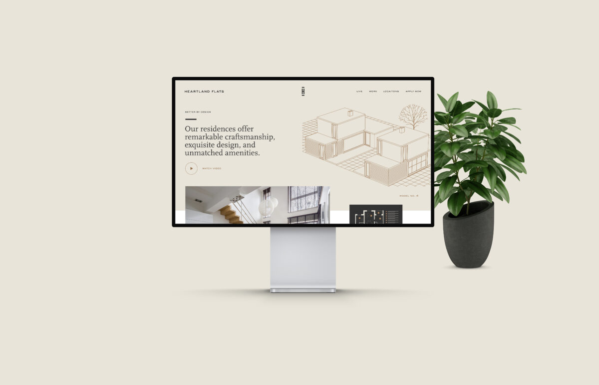
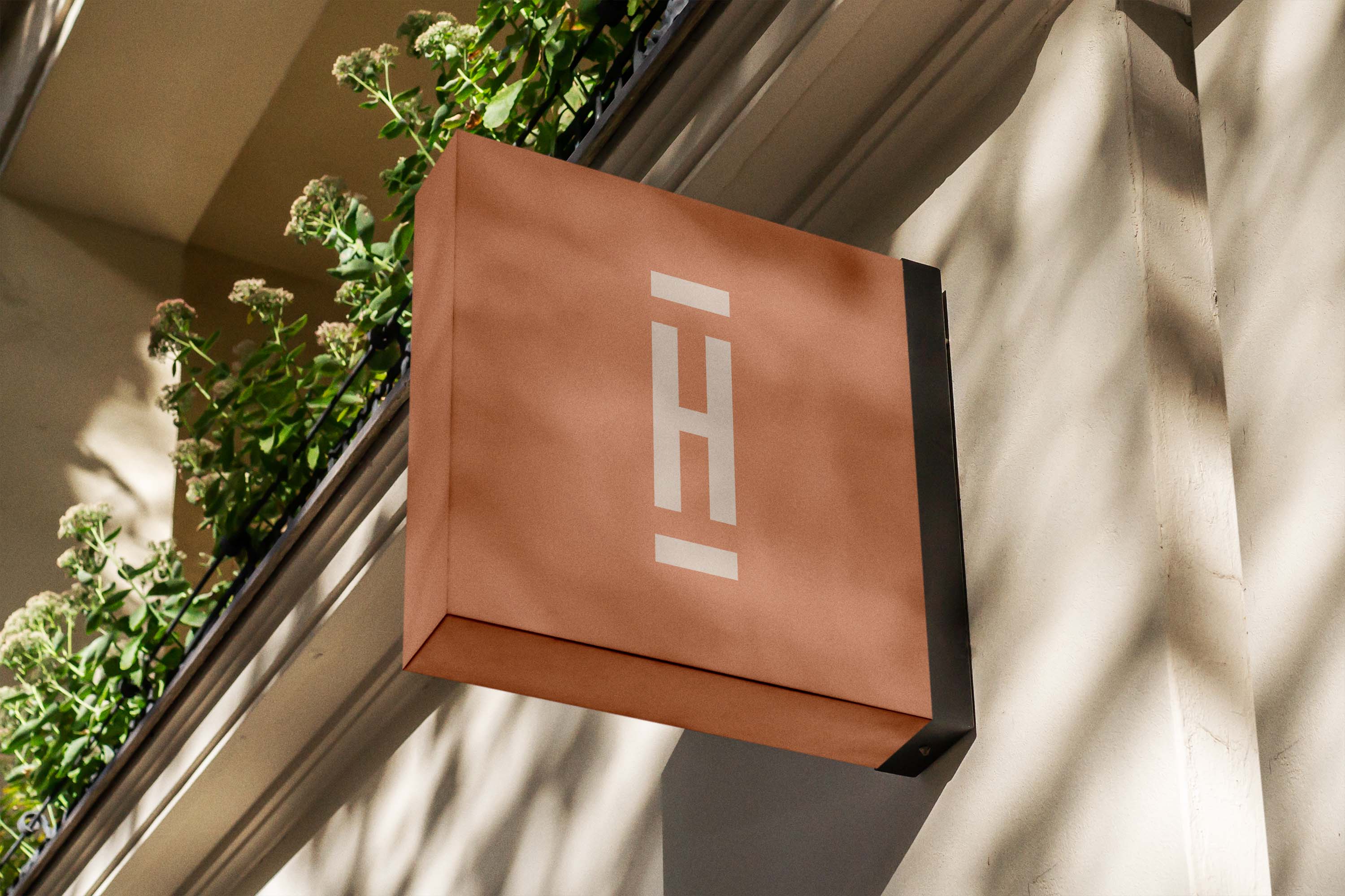
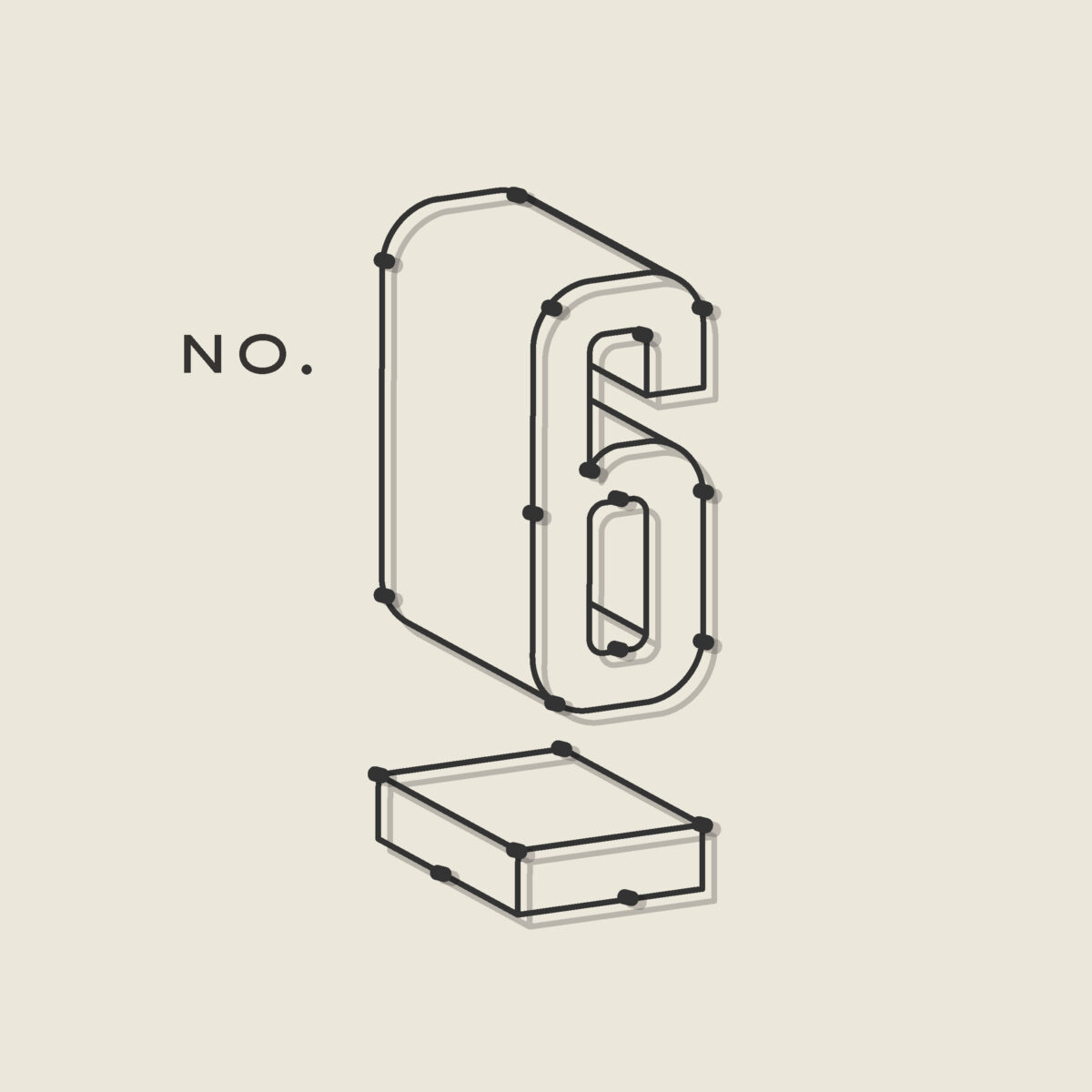
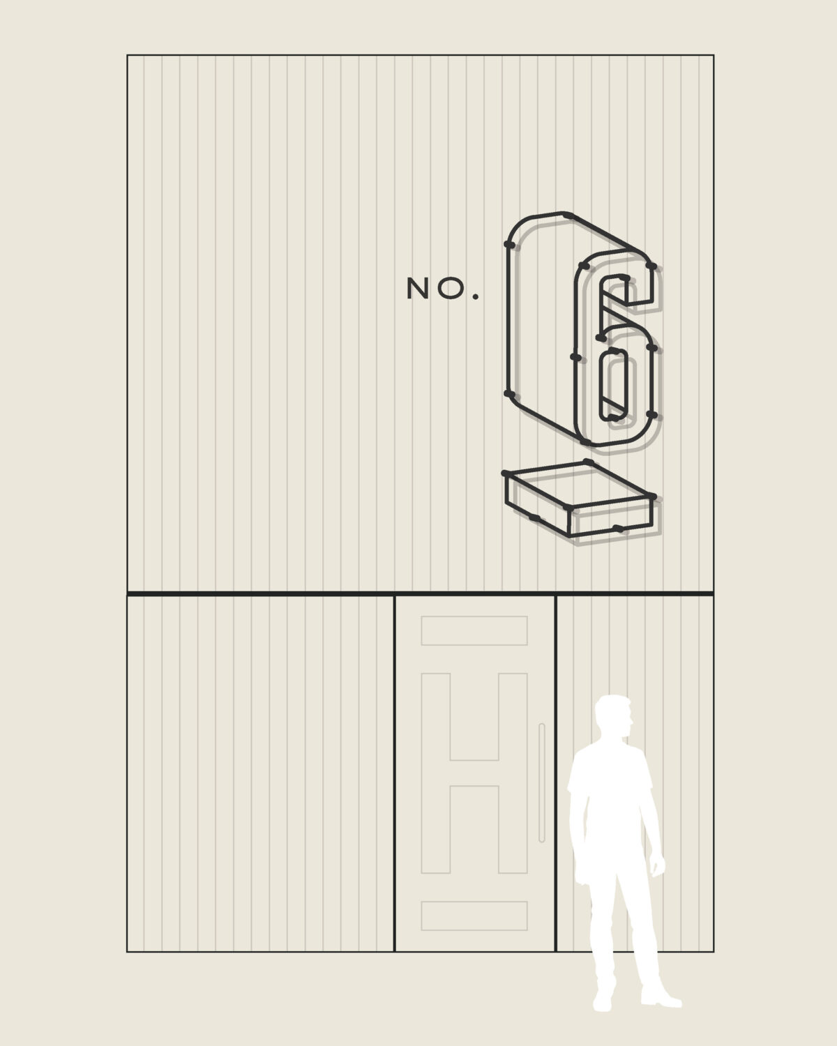
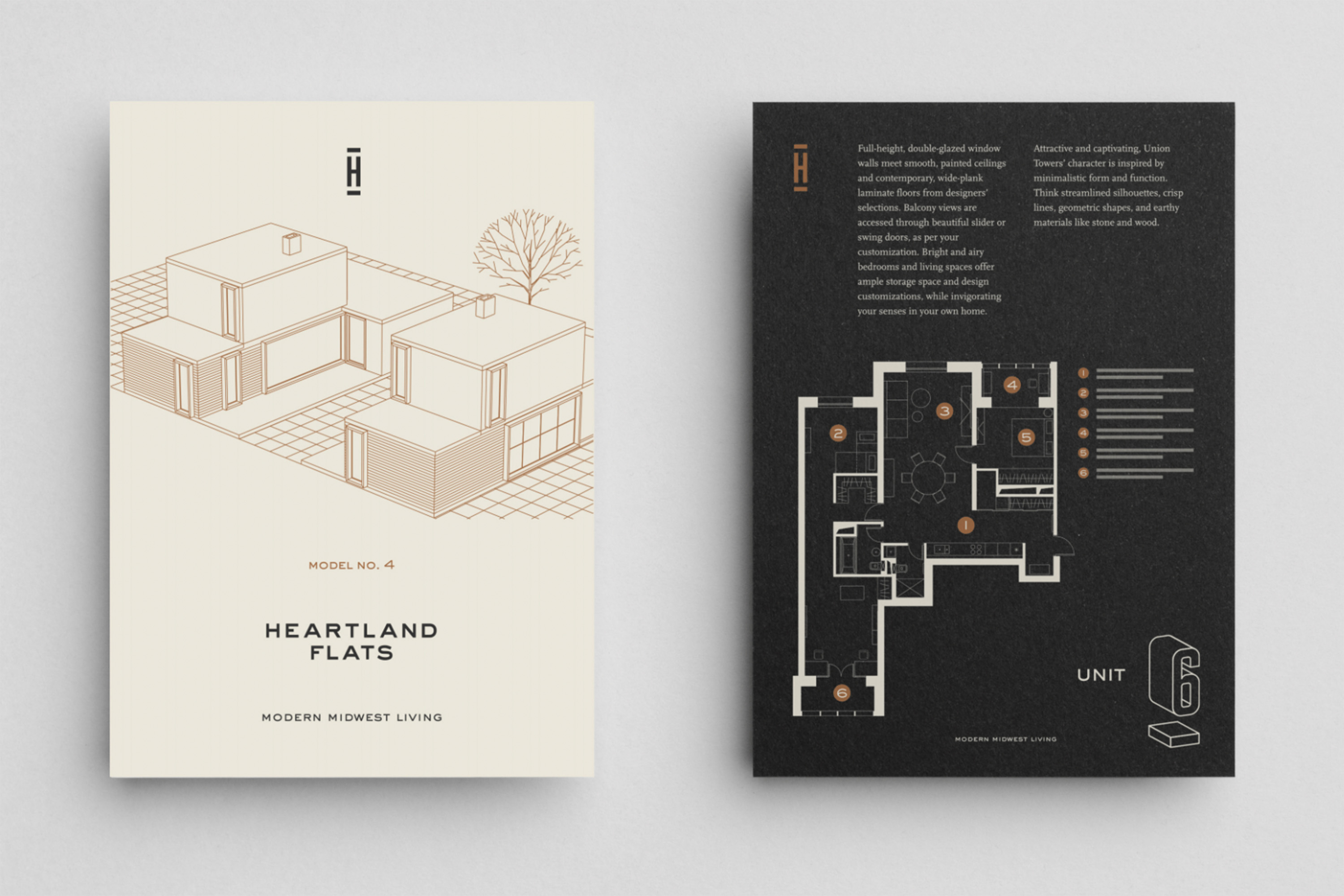
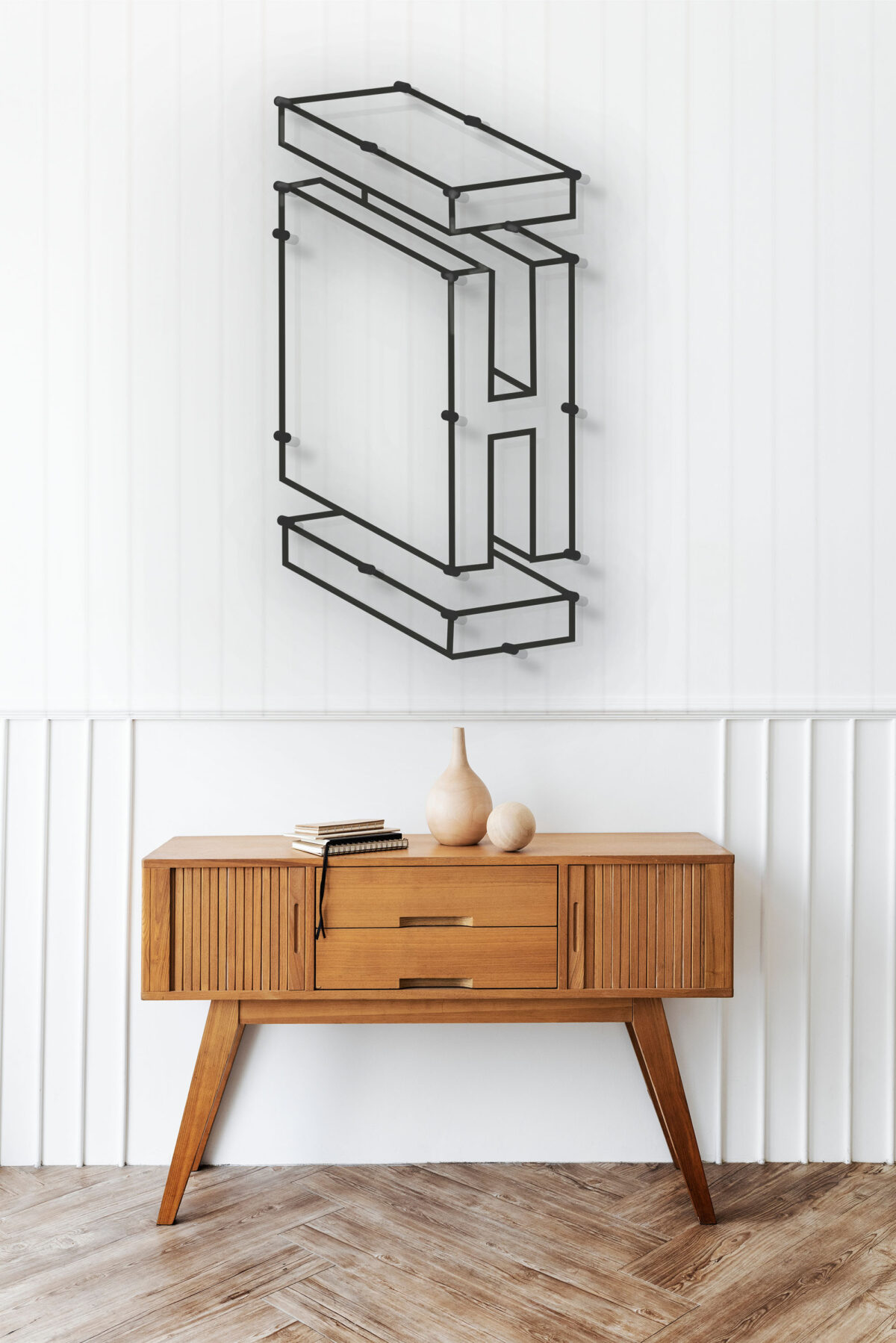
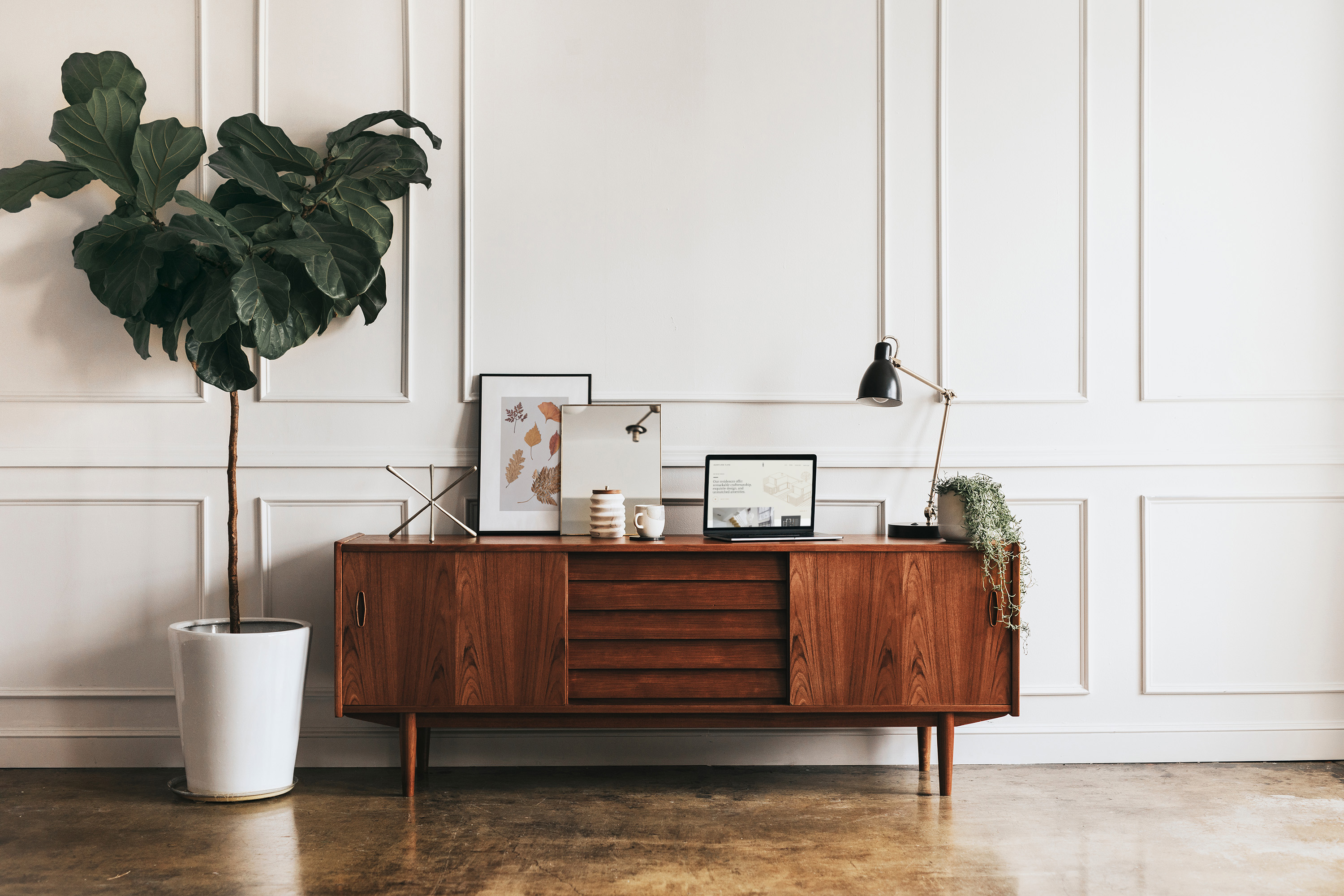
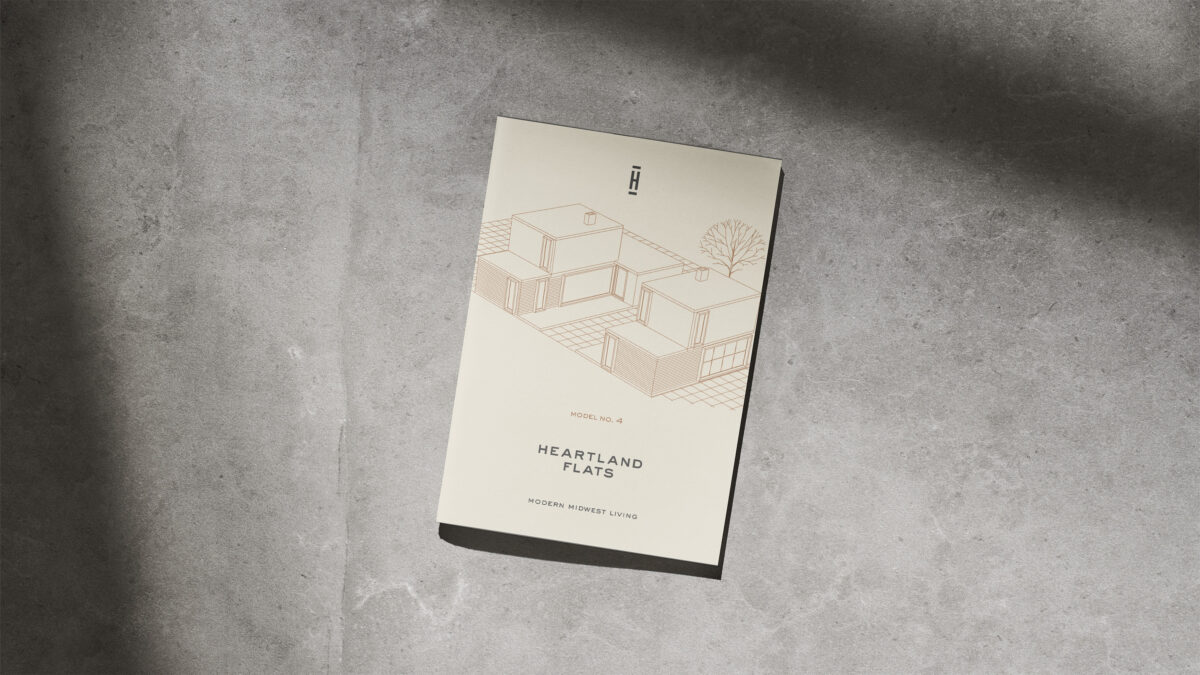
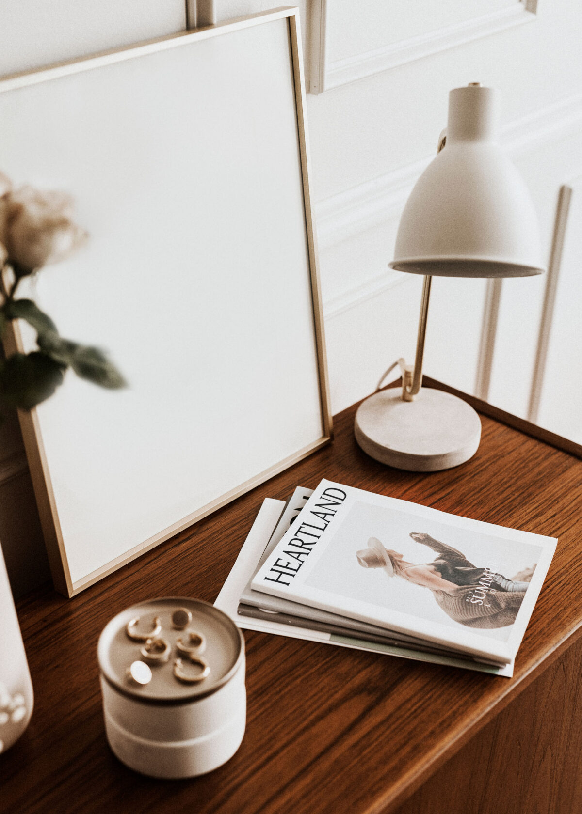
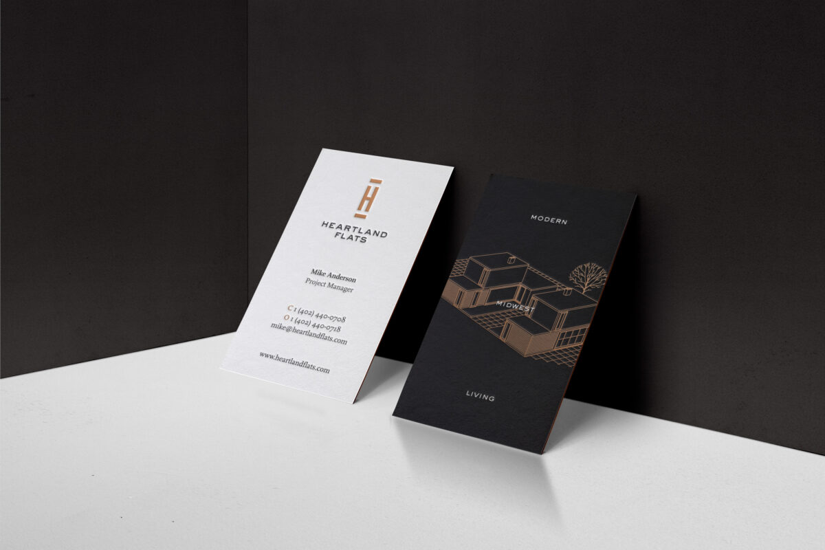
We needed to create a brand that was modern, yet historic and timeless. It needed to speak to people of the Midwest and those headed this way. This concept was expected to translate to architecture, print, and digital implementation. This implementation can be clearly seen in the following brand extensions: card, handbill, window decal, website concept, and even a concrete stamp.
02
The Solution
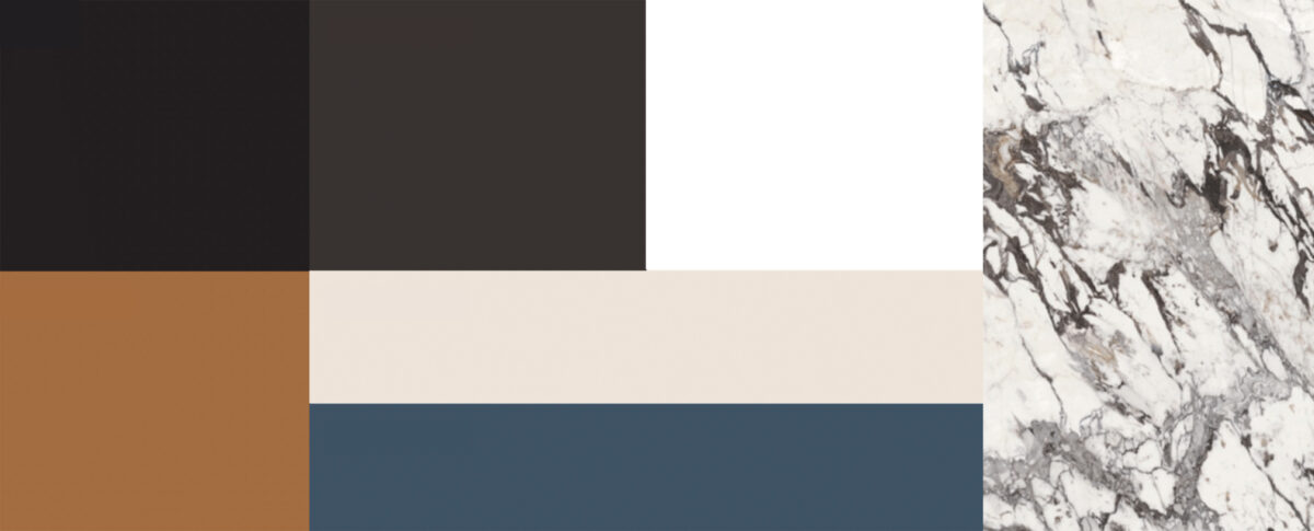
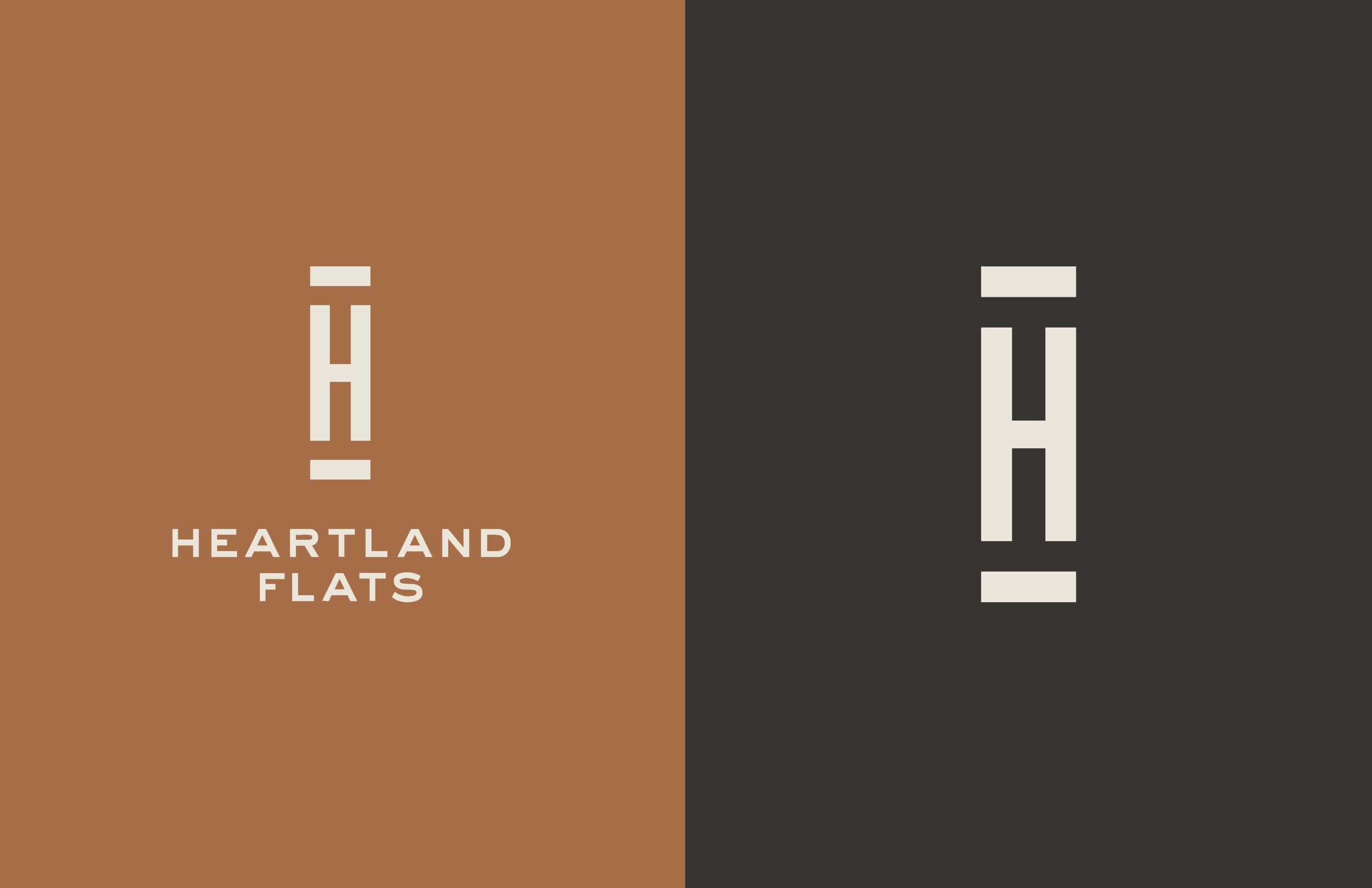
By featuring a soothing, contemporary color palette of black, espresso, white, burnt sienna, boiled cream, and dusty blue, along with crisp, geometric graphic elements, this brand presents an easy to use evergreen experience. It is perfectly tuned to Midwestern sensibilities.
03
The Outcome
This brand says, “Welcome Home to modern Midwest living.” It elevates remarkably crafted residences with exquisite design and unmatched amenities.
