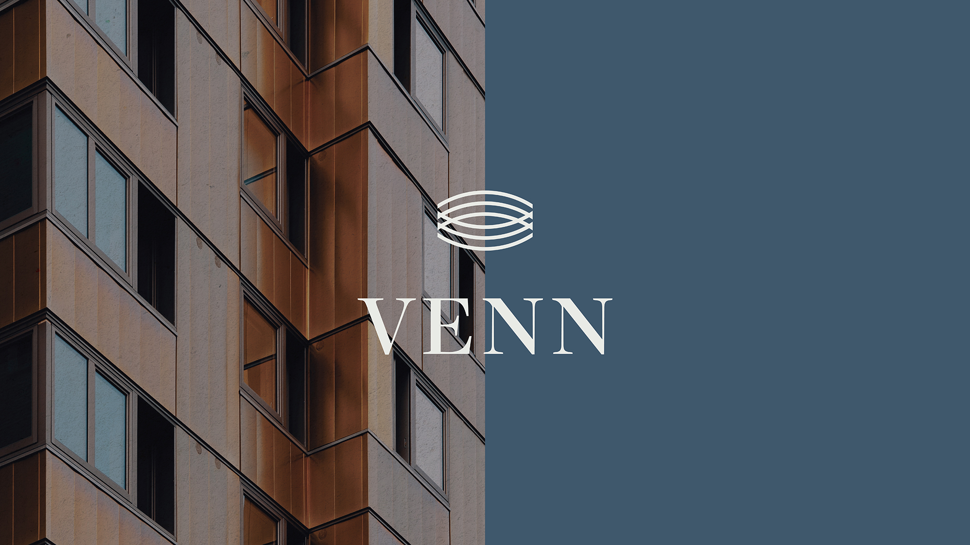
All good brands start with a name. For this Capital Investment Group, that name was Venn.
Venn (n) a graph that employs closed curves and especially circles to represent logical relations between the terms of propositions by the inclusion, exclusion, or intersection of the curves.
A Venn diagram is used to illustrate the local relationships between two or more sets of items. This is where Venn Capital came to life.

01
The Challenge
Venn Capital represents three entities coming together with common interest through their investors. As time continues, the goal will be to have more common ideas, wants, and needs to ensure a flowing diagram of everyone involved. This goal was kept in mind while we worked on their branding.


02
The Solution
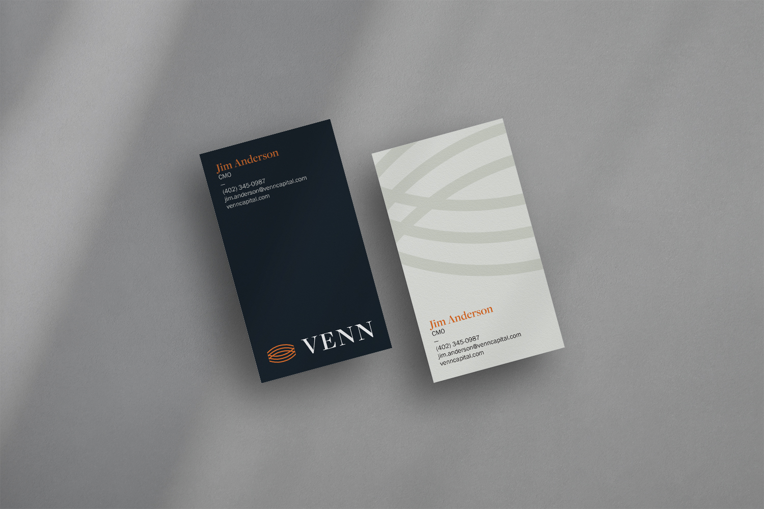
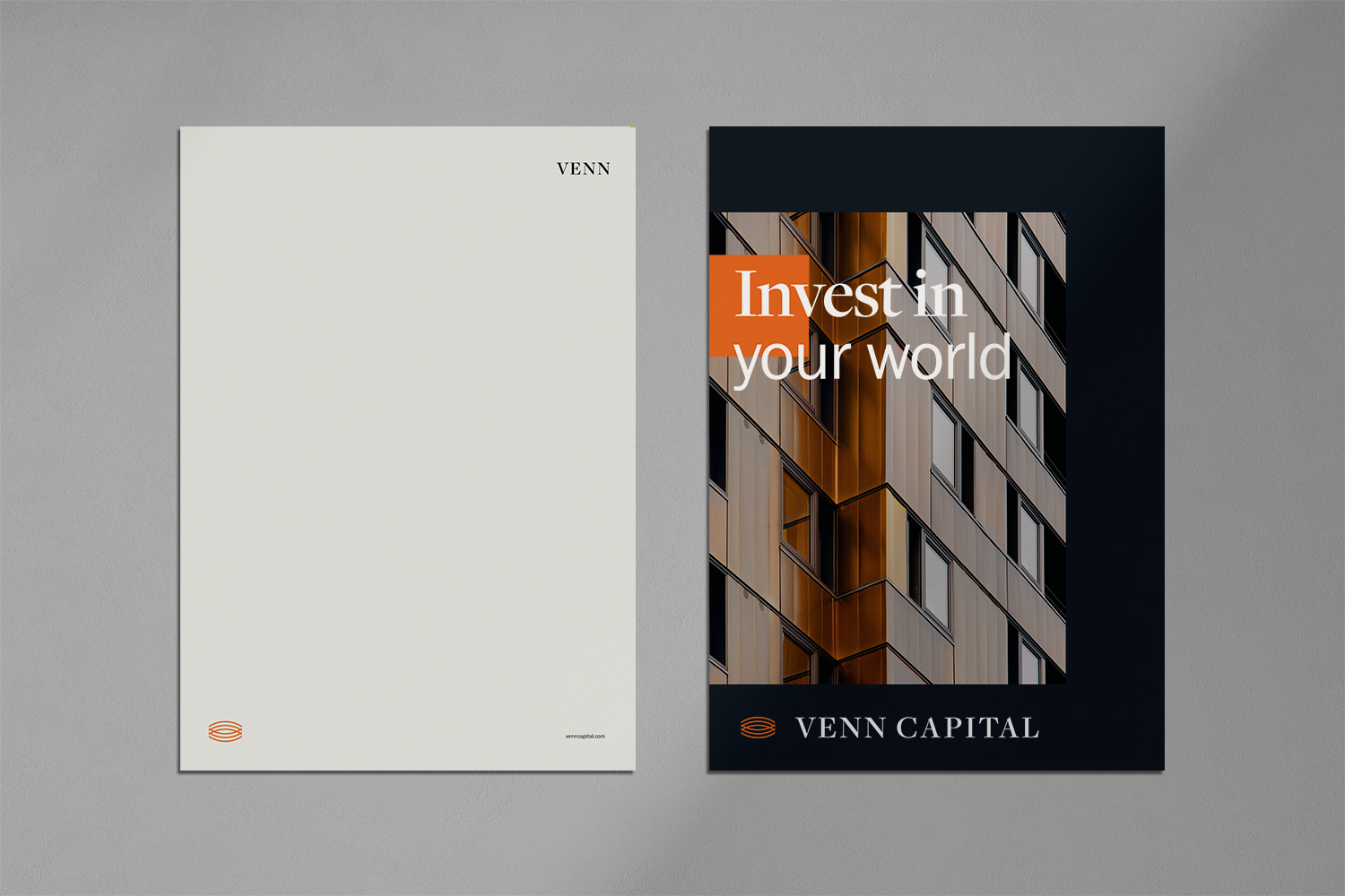
This brand leans into a historical yet thoroughly contemporary look and feel—offering viewers a sense that Venn is a storied and trustworthy organization.
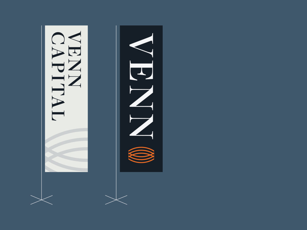
This brand features a rich color palette and confidently structured layouts. Combining regal serif-based word marks with precise geometric grids. Natural textures and landscapes make for an upscale and refined visual presence.


03
The Outcome
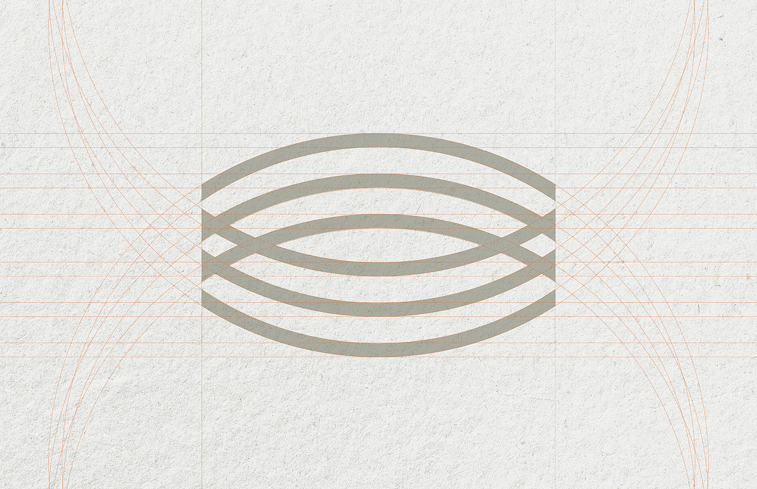
Where the present meets the future, where potential meets progress, and where investment meets return: that’s where you’ll find Venn Capital. This capital investment group is looking forward. With a sleek, mathematical mark, and sharp, confident type treatment, the Venn brand is ready to create the intersection between growth and greatness.
