Logo Design: A Simple (but not Exhaustive) Guide
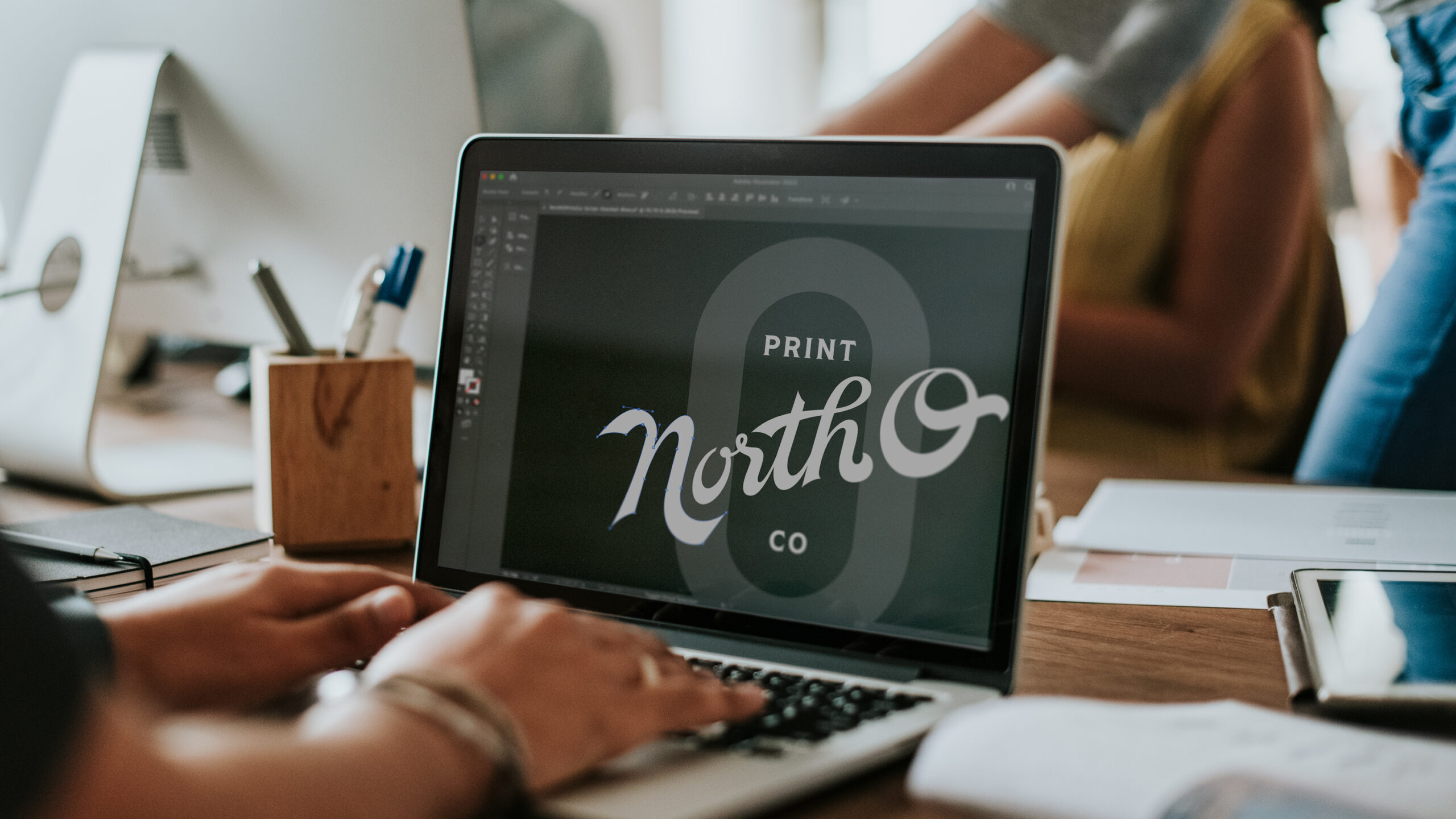
Logos: One of our favorite things to design and something that can really help successfully launch a new business, campaign, or refresh a brand. Many business owners get excited when considering the thought of a new logo, however, that enthusiasm does not automatically result in great design. That’s where things can get a little tricky, so we’ve compiled a simple list of things to consider when venturing into the wonderful world of logo design.
Color: When You Need It and When You Don’t
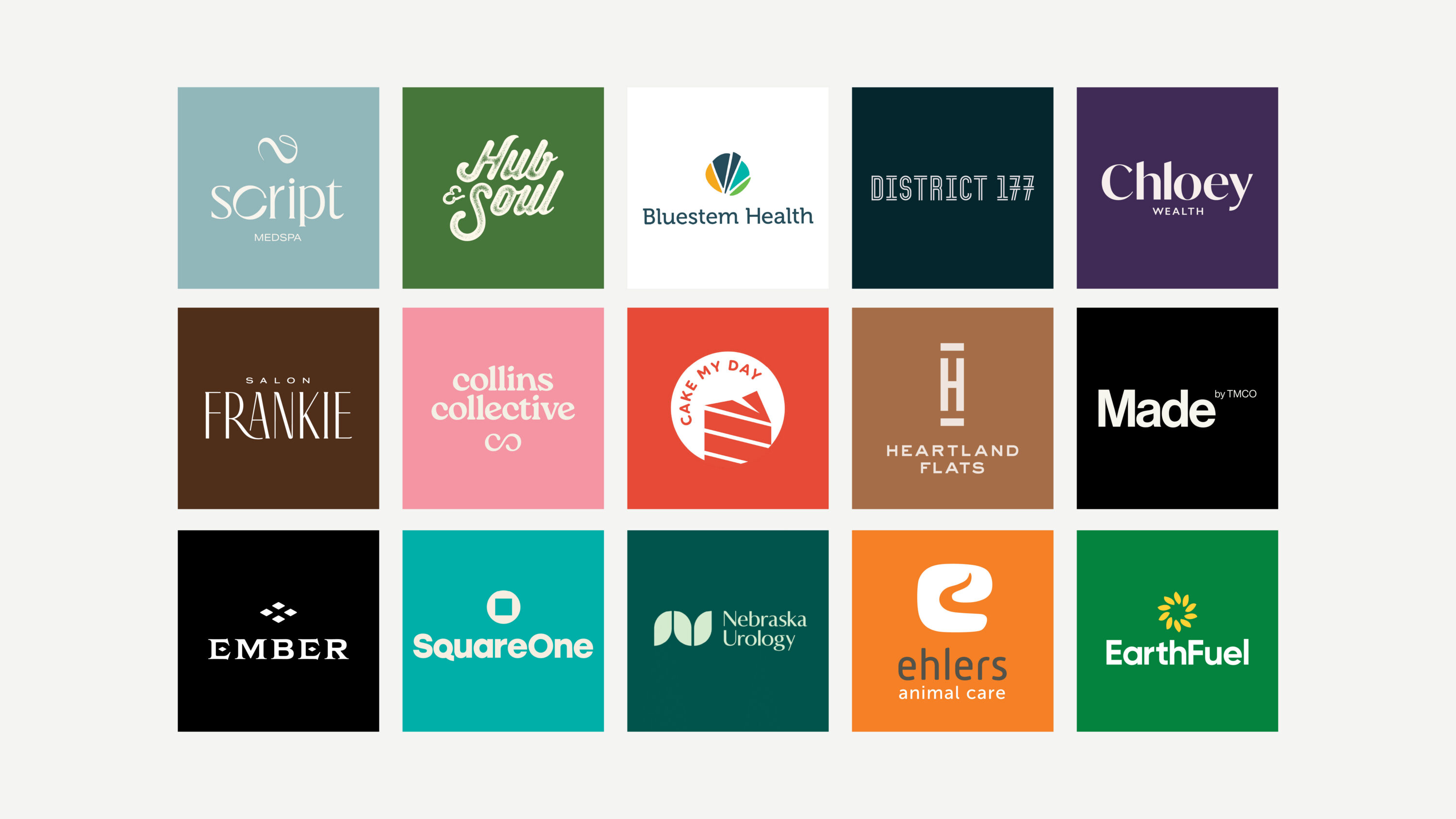
Everyone seems to love color and why not? Color conveys feelings and can really bring a design to life–but when is a good thing too much? The most important thing to remember is that color should be strategic. When working with color, it should be included when it clearly defines or enhances the voice of the brand as well as the design itself. Also, remember, it never fails that you will need to use the design in solely black and white. A design should always be able to speak clearly in its colorless version and getting it to work in both environments is no small task.
KIS (Keep It Simple)
Everyone seems to agree that simple is better but what that looks like is not always easy for everyone to agree upon. This means timeless and targeted typography (i.e. type) and/or imagery. What makes the most memorable logo designs, well, memorable? At its most basic: clearly defined elements, their relationship to each other, and their brand relevance. It’s easy to get excited about details that seem to add to the whole picture but as it can often be said in written communication, don’t use 5 words when 3 will do. In this world of quick and instant communication, if your logo is not speaking quickly and clearly, it’s not doing its job.
Don’t Forget It Needs To Work!
This should be obvious but sometimes it’s easy to forget once you’ve seen something shiny. Now, more than ever, a design needs to be versatile. How well does it work, very large and very small? Can it be simplified further for use on small mobile devices and social profiles? Can it get embroidered on a shirt and or be scaled down to less than an inch in size when imprinted on a pen and still be legible? Can it handle being included on large signage and easily viewed from drivers on the road? You may have found that if you haven’t selected a good logo design you might end up altering to accommodate printing or production requirements which is not an ideal solution. Get it right the first time and you won’t have to worry.
How Well Does It Speak?
If you don’t know how it speaks, here’s a good test. Take a simple survey from a few random folks–it could be friends or anyone not closely associated with your business or brand–and ask them what 3 words first come to mind when they see your logo. A good design should always reflect the nature of what it represents. Do their words fit? If not, it may be time to rethink your design. And this leads to the start of the whole process. Understanding the brand or message that it is to represent helps ensure the end result is a success!