Bluestem Health
A renaming and rebranding transformation.
In 2017, Eleanor Creative was retained to rename and rebrand the People’s Health Center with an updated brand identity to express its mission of being a trusted resource for excellent healthcare. Our hope was to create a brand experience focused on creating a healthy, vibrant community for all people, regardless of insurance status.
Objectives
Within the Lincoln community, the name “People’s Health Center” had been commonly confused with other local organizations, such as the similarly named People’s City Mission and the Center for People in Need. Both are fantastic organizations but provide different sets of services and goals. They found a growing perception that the People’s Health Center was a free clinic and only served those who were uninsured, when in fact, it does not provide free medical care and serves both insured and uninsured clinics across the city. They wanted a brand that would move them forward as a vital healthcare facility for the whole community.


Strategies
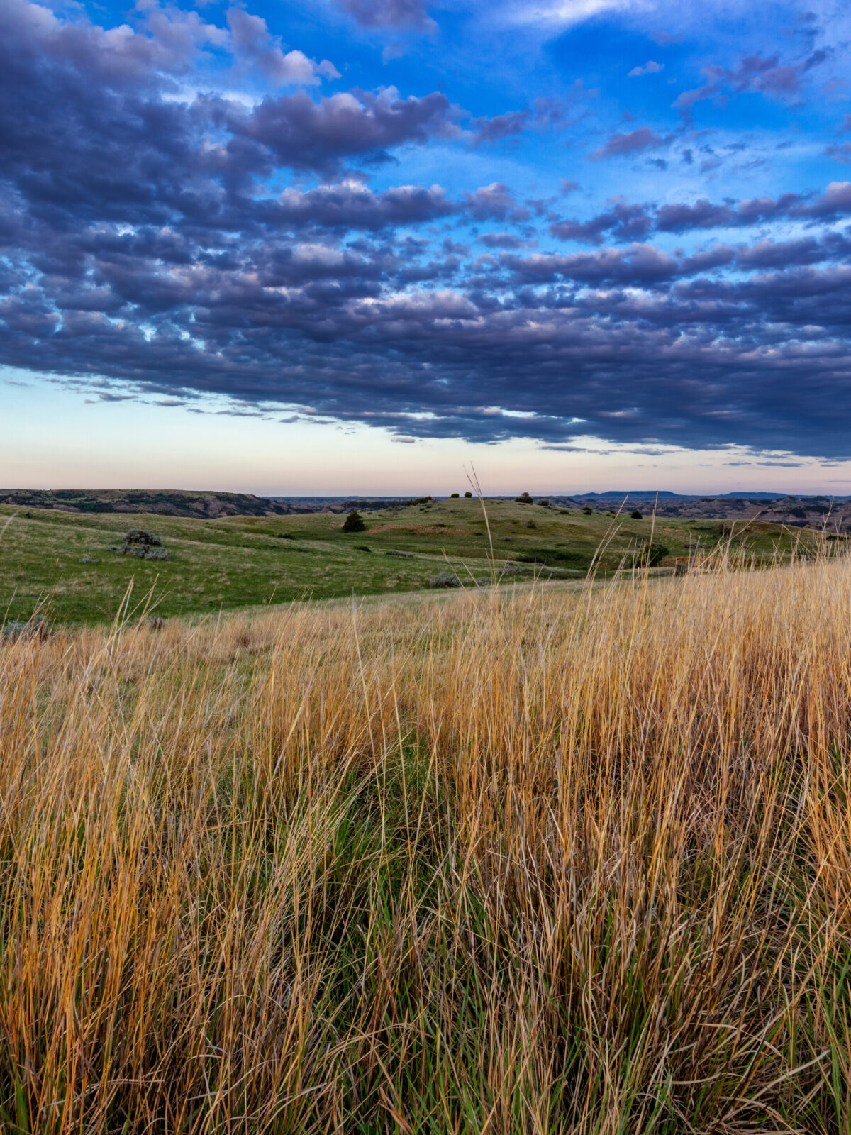
Eleanor researched hundreds of name possibilities and the People’s HealthCenter team and board members favored “Bluestem” because of its Nebraska connotations and positive imagery. Little Bluestem is Nebraska’s state grass — an adaptable grass that is both beautiful and strong. Bluestem is a tough and tolerant native grass, with a root system that can grow over five feet deep. It is known for being one of the best grasses for animal habitats that provide shelter, home, and healing. Providing a home and a healing place was precisely the image Bluestem Health wanted to evoke as it launched a new identity to demonstrate a more inclusive approach to healthcare.
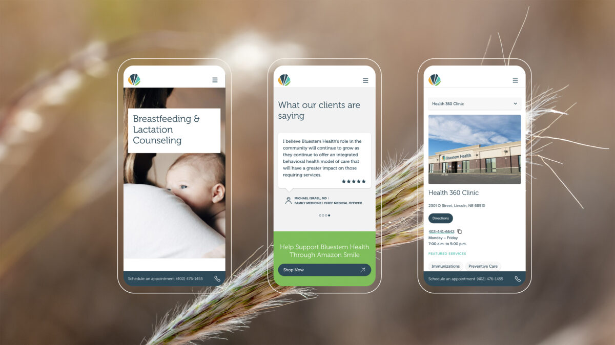
Eleanor Creative designed a new logo system and brand experience that was warm and welcoming to all people and cultures, just like the bluestem grass it represents. Eleanor connected the diversity of Bluestem Health to the variety of colors found in bluestem grass. The foliage of the grass, which combines pastel colors in summer and coppery tones in fall, is a beautiful symbol.
Results
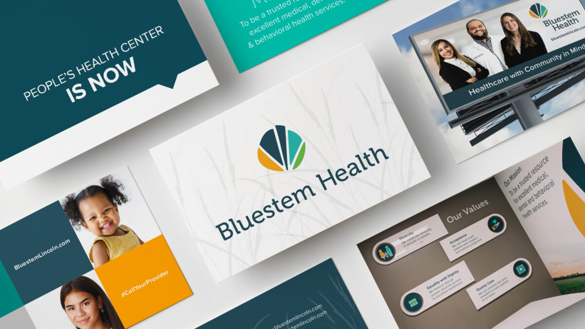
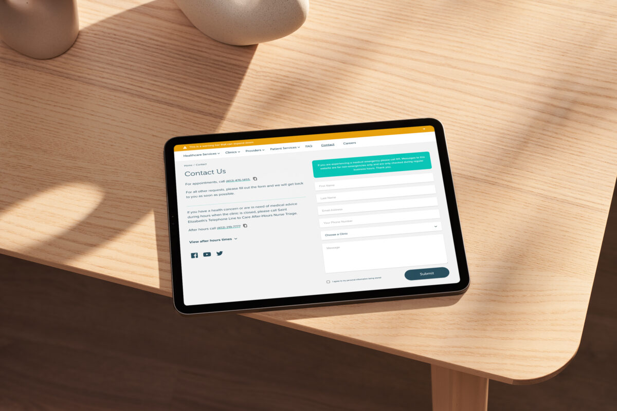
Eleanor created a brand identity that could be used across five locations, including newly acquired clinic sites and services throughout Lincoln. We were able to maintain the integrity and history of providing healthcare unique to each location while incorporating them within the corporate umbrella of Bluestem Health. Eleanor Creative in Nebraska is currently the agency of record for Bluestem Health and has been partnering with them since 2017.