Lincoln Medical Education Partnership
A rebrand and brand unification experience.
Lincoln Family Medicine Center, Lincoln Family Medicine Residency Program, Lincoln Medical Acupuncture, and Stepping Stones. Over the years, Lincoln Medical Education Partnership (LMEP) had approached each program as its own brand, thus not always connecting consumers to all of the services as one organization. Streamlining a family of brands is an intricate process – one that we love. Our goal is to always create timeless, scalable, and smart logos that can be used effortlessly for years to come. We started by designing an overall brand identity, then made sure that each “member of the family” had their own look and feel that was similar, yet distinctly different.

Lincoln Medical Education Partnership
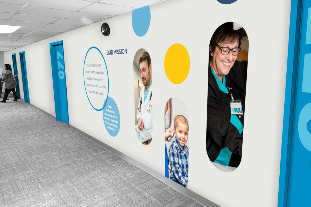
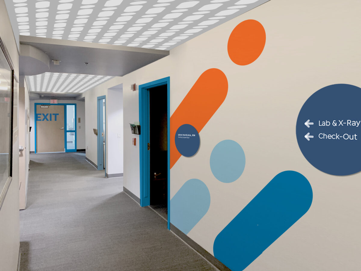
With LMEP, we understand that medicine is ever-changing. We wanted to create a brand that represented a patient-centered approach to medicine, while creating a cohesive look. We incorporated marks that are vibrant, suggesting movement, while providing a solution to disconnected branding. Since people are at the heart of LMEP’s services, each mark is designed around the concept of a human form taking the simplest shape. The marks are forward-thinking and contemporary with many dynamic parts to provide opportunities to experiment with brand pattern, color, and shape. The Lincoln Medical Education Partnership mark is inspired by the idea that LMEP is a partnership of distinctly individual units working together to advance health in the Lincoln community. As the parent brand, the mark represents an umbrella under which all the organizations find guidance and work toward common mission.
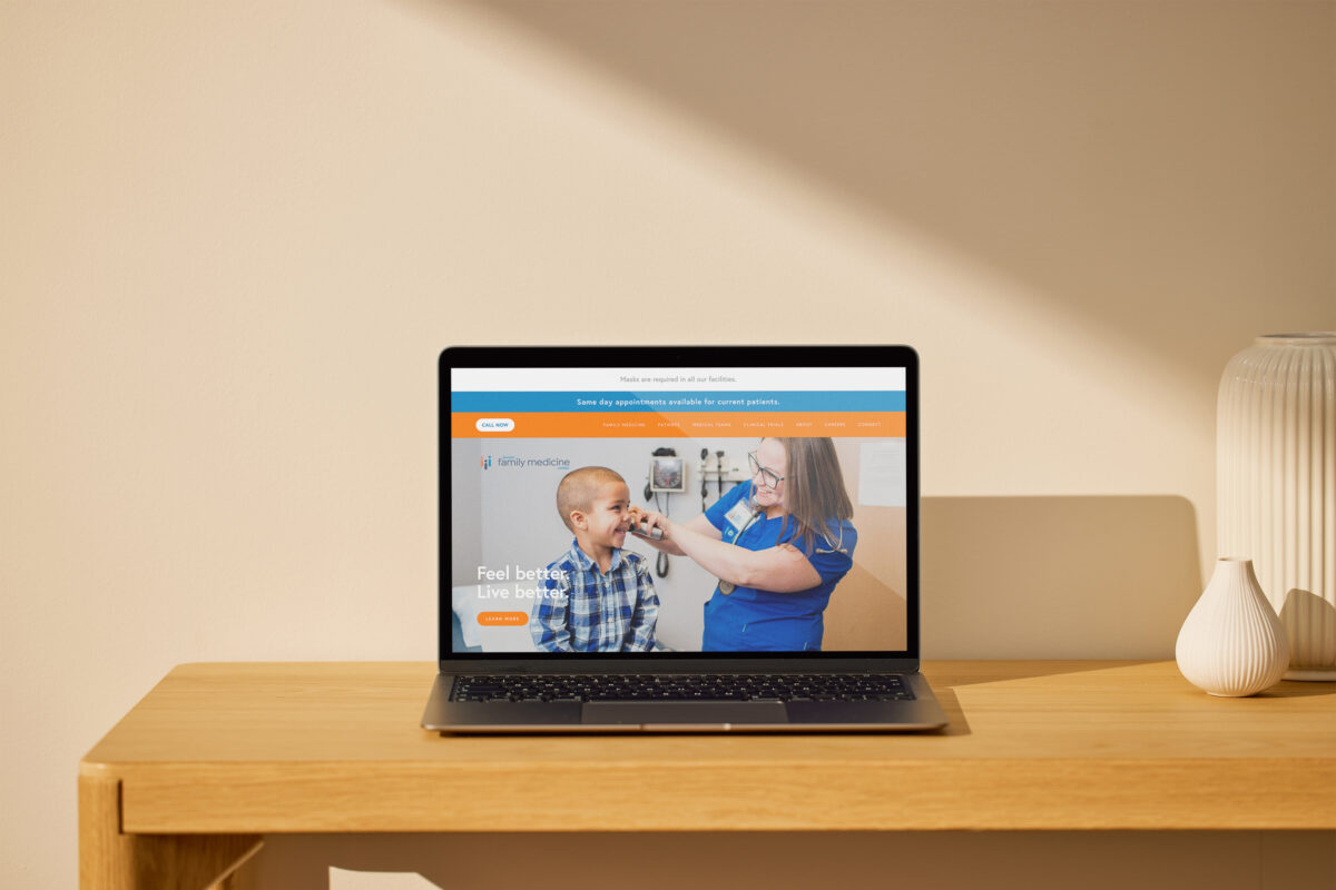
Lincoln Family Medicine Center
Lincoln Family Medicine Center has been providing family medicine, maternity care, behavioral health, and other important preventive services for decades. The Center’s approach to medicine uses a model of care based on a team approach, combining both faculty physicians and medical residents. For their logo, the mark is modernized by forming a small family while establishing a color scheme that is shared with LMEP.
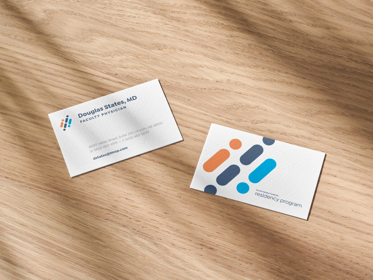
Lincoln Family Medicine Residency Program
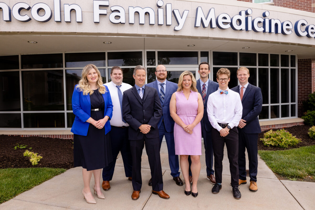
The Lincoln Family Medicine Residency Program is a three-year medical training program for family medicine residents. Each year, eight new residents from across the U.S. come to expand their experience by putting into practice their knowledge of treating patients at the clinic. The color scheme of the Center’s mark is echoed in the residency program, the heart of LMEP, and brings new energy and life to the organization. The mark features momentum as the people make a steep, steady climb toward higher learning. The three lines represent the three-year cycle of residency.
Lincoln Medical Acupuncture
Lincoln Medical Acupuncture offers an integrative approach to care by combining evidence-based Western medicine with acupuncture to improve overall quality of life. This mark continues the theme of people in simple forms, but flips a single form to create a needle that moves through a serene frame to symbolize treating pain and pressure, and improving the lives of patients who receive acupuncture.
Stepping Stones
Stepping Stones offers hope and healing through outpatient services, including drug and alcohol evaluations, counseling and treatment, youth substance abuse counseling, and various resources. This mark creates an “S” shape toward Stepping Stones’ goal of inspiring individuals and reflecting a stone path that takes patients on a journey embraced by positivity.